When your site’s main aim is to turn visitors into customers, there are several important aspects that go into the designing of your website. However, the most important aspect of all is creating a design that is overall deliciously beautiful, regarding the experience and the aesthetic. A website design that is beautiful has the potential of stopping a site visitor just long enough to become a customer.
Many retailers may agree that they have seen beautiful web designs, however, they may not remember what made these designs so ‘beautiful’.
We have collected the top ten most deliciously beautiful shopify store pages to jog those web designers memories.
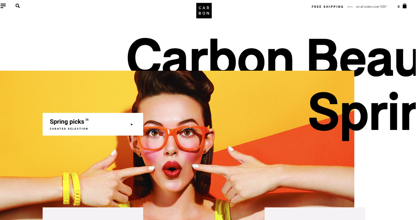
While scrolling through Carbon Beauty’s home page, this image stops visitors in their tracks using a pop of color and a creative layout. While transitioning through Carbon Beauty’s pages, the intriguing pictures and beautiful aesthetic continues to keep visitors engaged.
2. Pipcorn
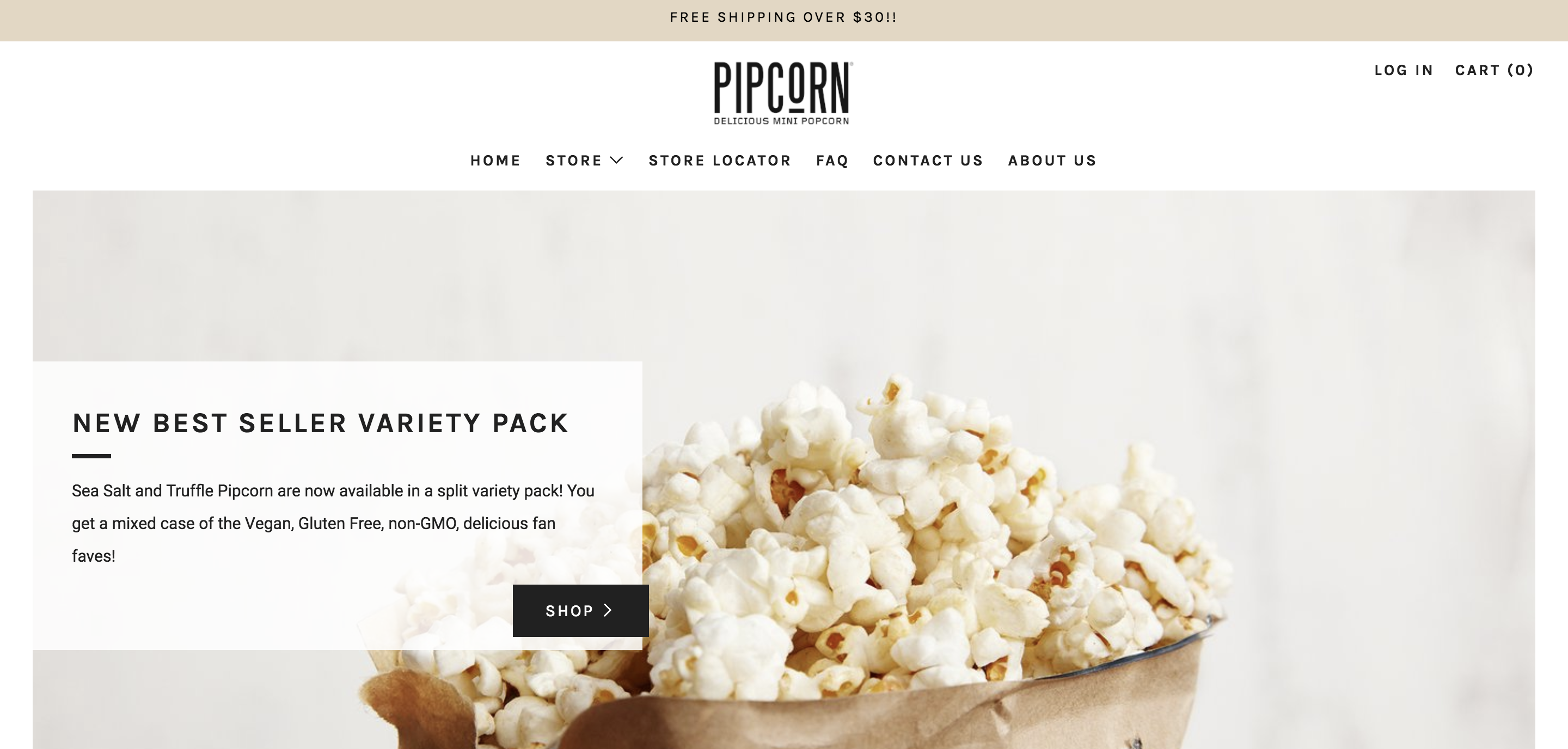
Pipcorn chose a clean straightforward image and layout. By using this minimalistic design, Pipcorn was able to show visitors who they are as a brand. Pipcorn’s simplicity and natural ingredients were able to be showcased and linked to the design throughout the entirety of their website.
3. Triangl
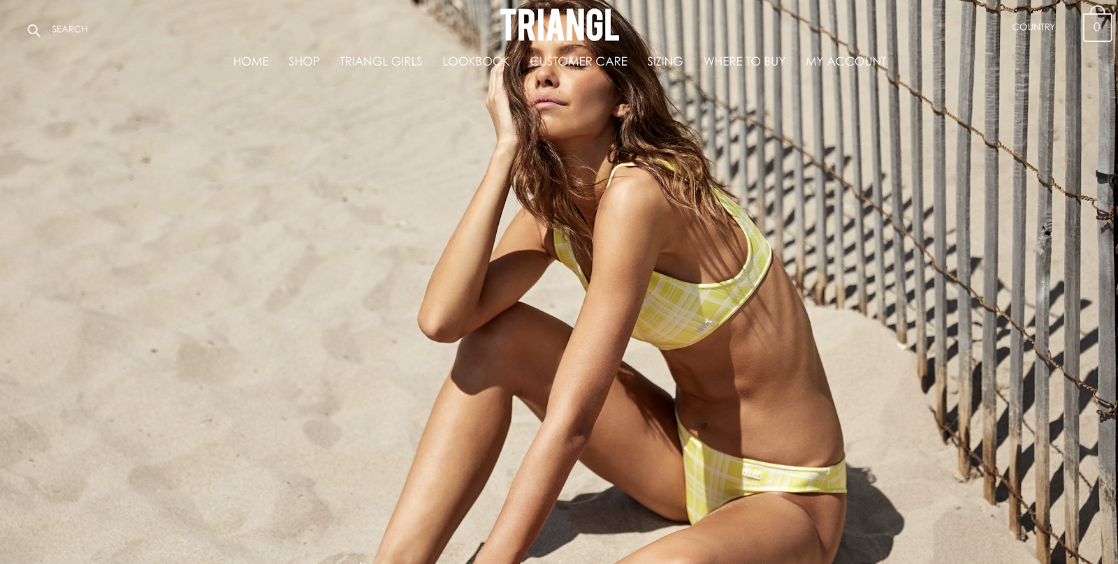
Through a wide high resolution imagery slideshow with a simplistic twist, Triangl is able to raise interest in their site visitors influencing them to explore their website. Triangl was able to make their bathing suits the main focal point of their home page by taking away the ability to scroll down. Taking away the ability to scroll on the homepage left visitors compelled to pay more attention to Trangl’s models sporting their brand and trends of bathing suits.
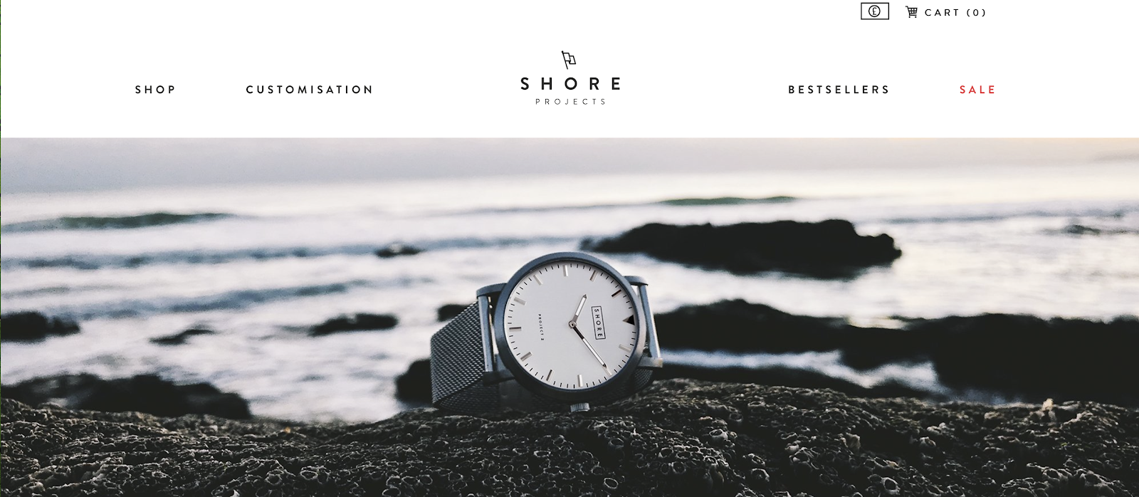
Shore Projects incorporates their theme of natural beauty throughout their website, starting with the homepage. They are able to sparks their visitors interests by using focused imagery of their product with an out of focus landscape foreground. Overall, by using an interesting focused picture as their homepage and associating the image with their theme, Shore Project makes their product and brand the prime focus of their page encouraging visitors to explore more.
5. Ratio
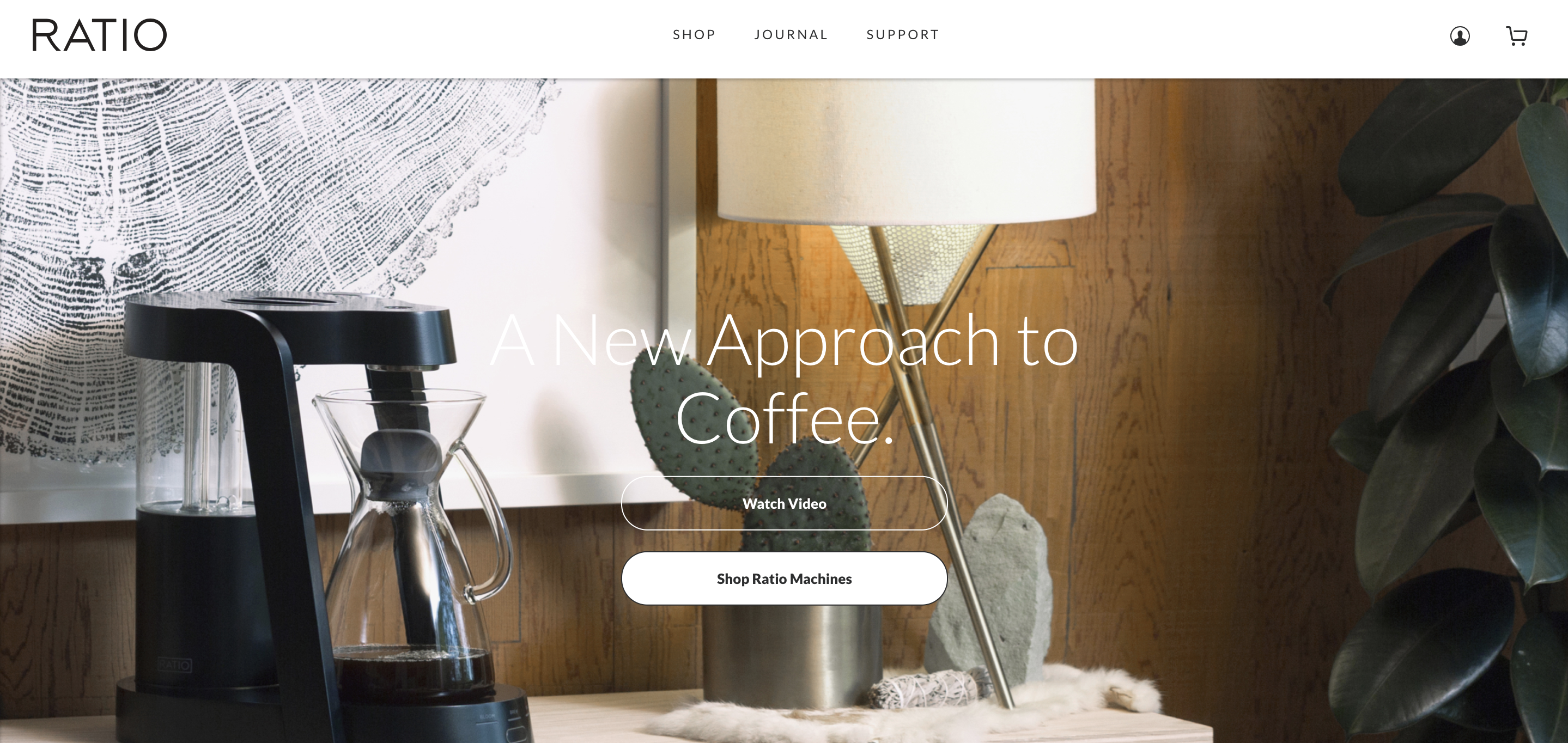
Ratios products are modern and stylish for everyday use. To show off their avent-grande style they display how product such as a coffee maker can still be a statement piece of one’s home. Ratio utilizes imagery and a straightforward approach to relay their message of style to their visitors. Ratio also uses a custom video offering a unique advantage over other forms of content because it does not just tells visitors about their company and product, it shows them.
6. Helbak
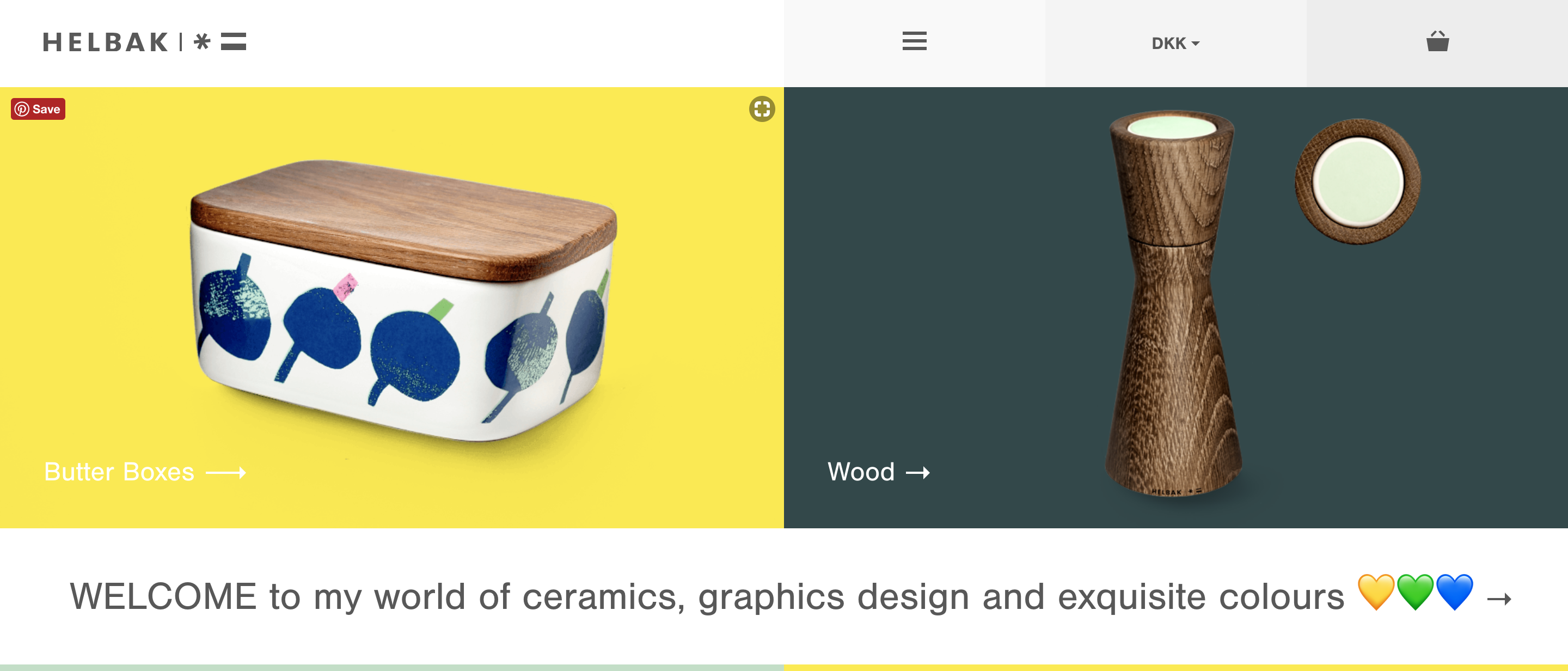
Helbak uses a beautiful color scheme to their advantage through pastel colors to create variation in their product grouping, while also drawing the site viewers attention to the products through contrast. The simple, but beautiful user friendly layout encourages the exploration of Helbaks products.
7. Gym Shark
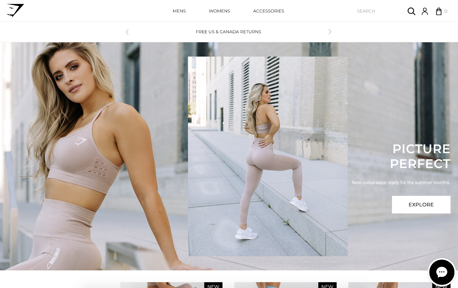
Gym Sharks sleek layout is a perfect representation of integrating the brands logo throughout the entirety of the website. Gym Shark has an elegant homepage that directs a viewer’s attention to their brand. They use a picture in a picture with contrasting colors which diverges the two pictures, but also grabs a equal amount of attention to both.
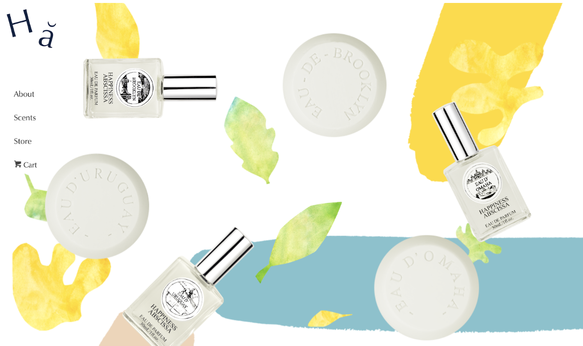
Happiness Abscissa comes to life using great and also eye popping colors. They associate energizing colors with their products to reach their audience. By using bright colors and interactive images which sway back and forth as you scroll, the site gives off a sense of youthfulness and also encourages visitors to to take a deeper look.
9. Hickles
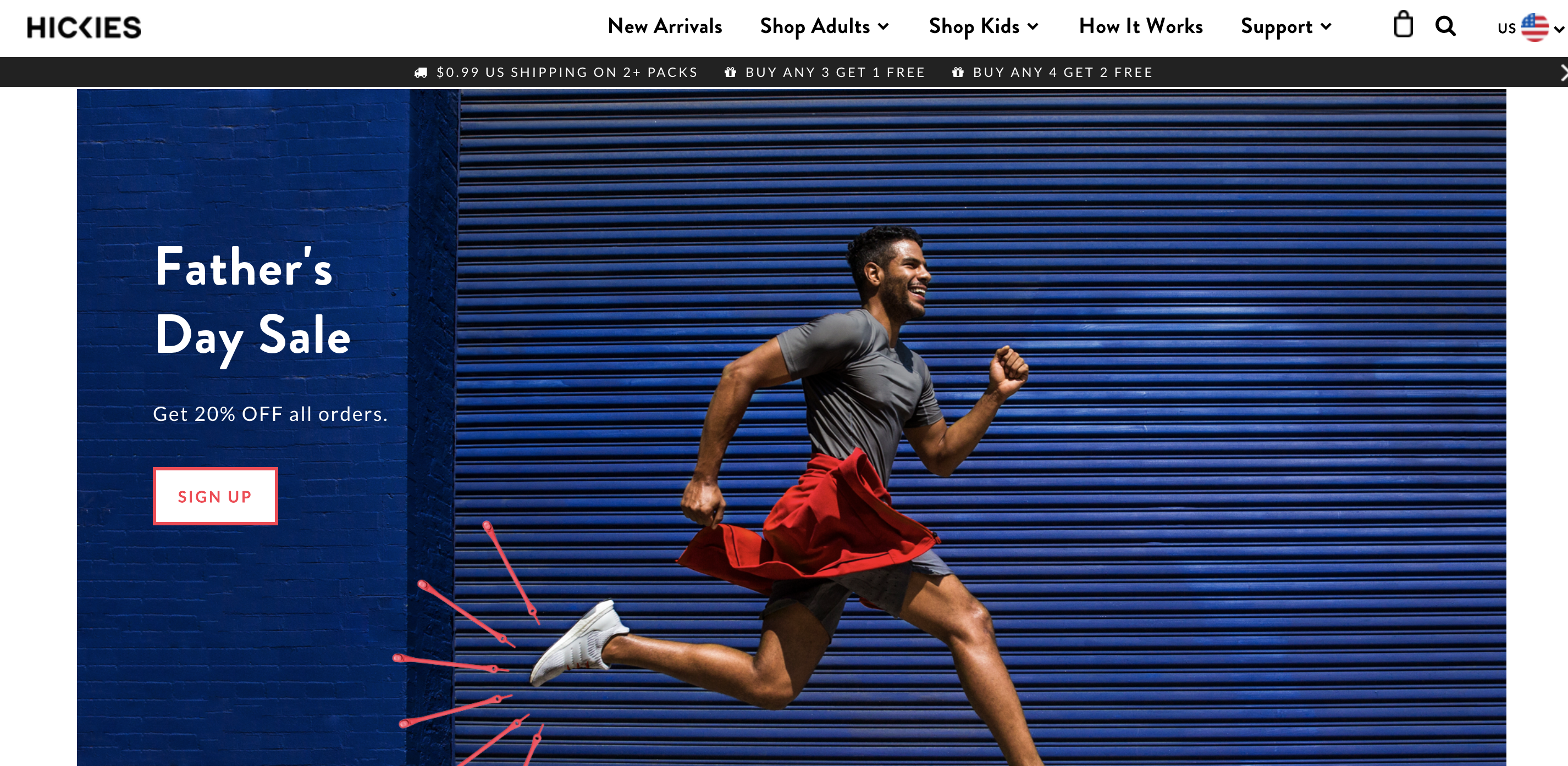
Hickles homepage sports a look that features great lifestyle, product photography and videos. It creates a linkage of one’s lifestyle and Hickles brand. By using a user-friendly layout with clear and creative links, Hickles is able to give the visitor a great experience while encouraging them to become customers.
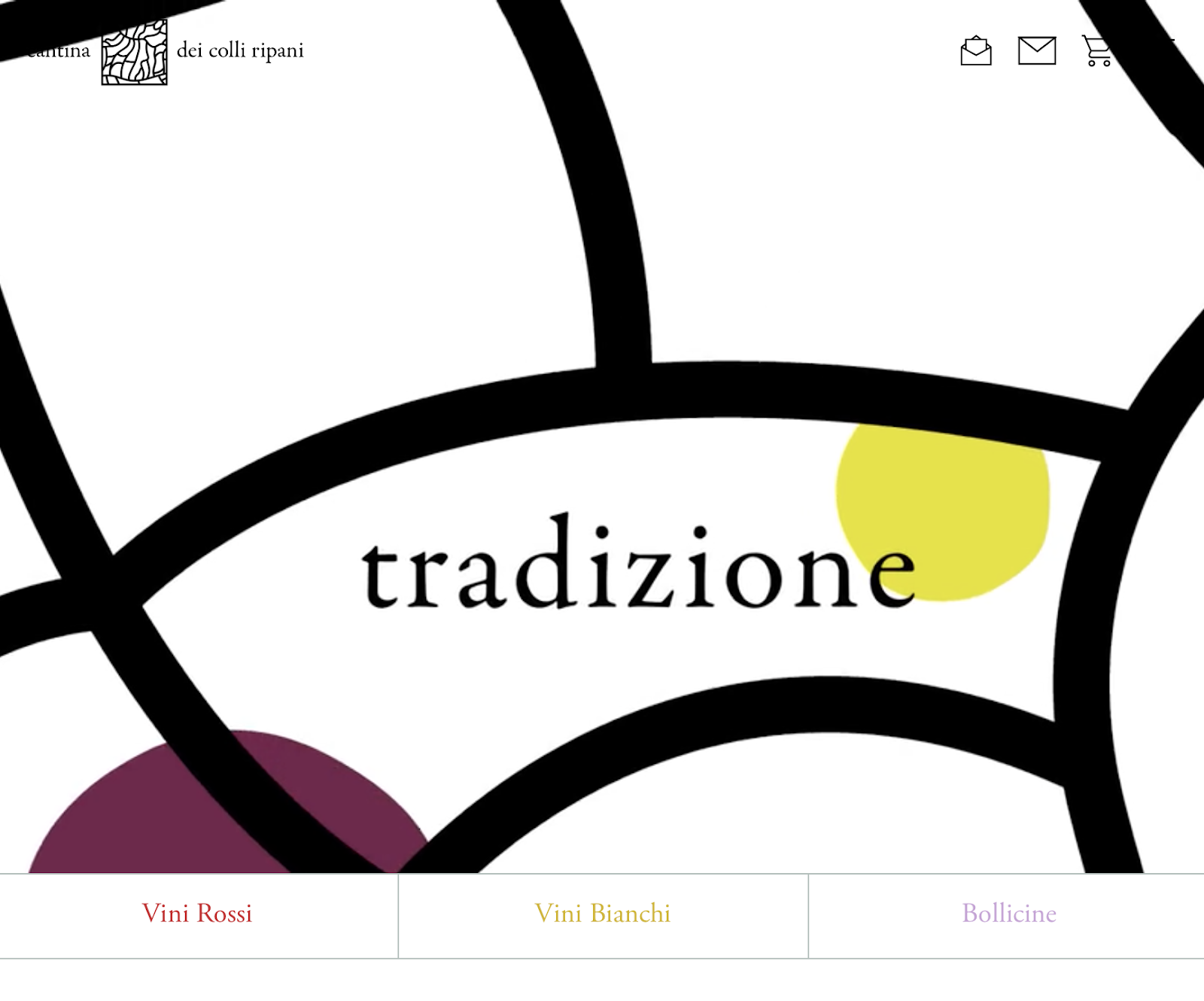
Cantina dei Colli Ripani uses a video as their homepage background which starts automatically as the homepage loads. By doing this the visitors attention goes straight to the background, which overall brings attentions to important words that describe the overall theme of who the brand is. Since people become easily distracted by anything that moves, Cantina dei Colli Ripani uses this distraction to their advantage by bring attention to their brand.
Design Deliciously
As you have seen through these ten designs, it does not take much to create a beautifully delicious design. By bringing the components of simplicity, contrast, user-friendly design, focal points, theme correlation, wide high resolution imagery, bright colors and interactivity that have been showcased through these ten shopify store designs, you too can make a beautifully delicious design. If you integrate these components correctly into your design, you may be able to stop your visitors just long enough to become customers and EAT IT UP.